Visualizing City Bike Data
This was a semester-long project completed after three years of study, equivalent to a Bachelor’s thesis project at other design schools.
For this project, we are required to choose from three clients. Andreea and I chose to work with the Oslo City Bike service; the service had not yet launched, and we saw this as an exciting opportunity to contribute input and ideas at a foundational level.
We were interested in all the data that Oslo City Bike receives. We wanted to see how we could visualize this data, and how these visualizations could be used to make Oslo a better cycling city. We also investigated what kind of data people were willing to share, and how we could motivate people to share their data if they knew it was for non-commercial purposes.
Project by: Andreea Tecusan and Jacob Pettersen
Project length: 4 months
AHO course: 6th Bachelor semester, Interaction design. 2016
Prize nomination: Nominated for Best Interaction Design
Early interviews
The most important finding from our research phase was that the municipal organization Sykkelprosjektet, which works to make Oslo a better city for biking, only uses data from the exercise app Strava. This data does not provide a complete representation of how Oslo’s population bikes.
We proposed that if they got more detailed data about how people in Oslo cycle (e.g. speed, GPS data), the organization could more effectively develop the city’s cycling infrastructure.
Generating ideas
We also explored the idea that people would be more willing to share their personal cycling data if they got something back. We developed concepts on how the collected data could be used to provide engaging and interesting feedback to users.
Concept development
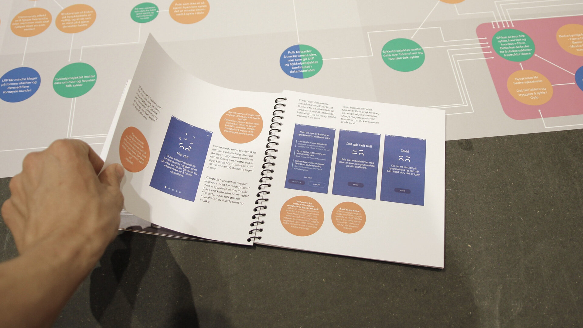
We chose seven of these ideas and made screens sketches of how the feedback would play out in a set scenario. Instead of prototyping only a few, we chose to prototype all of them and let people in the streets provide their feedback.
Wireframes
We then created wireframes of how all the different prototypes would work, click by click.
Making the screens
We imported these hand sketches into Sketch, where we created all the necessary screens.
Programming prototype
We used a prototyping tool to make the screens clickable on mobile.
Testing with people
We brought these clickable prototypes to City Bike users in the streets. We asked them to test the prototypes and comment on them.
The feedback
We received surprisingly little critical feedback on the idea of sharing personal speed and GPS data. We heard a wide spectrum of opinions on what functions people would like to see - some wanted as much feedback as possible, while others wanted just a few key data points, such as the total distance they had cycled over the course of the year.
The concepts
These are the different concept or ideas that we made into clickable prototypes which we tested with people as shown above.
The different ideas is about how Oslo city bike communicates about data from the city bike rides in different scenarios in a 5 year perspective. All from the information the user gets when opening the app for the first time to the diploma the user gets after 5 years as a customer of Oslo city bike.
1 - Downloading he app: The first concept ones what happens when you download the Oslo cycle bike. Here we created a introduction to what data Oslo city bike wanted, how they would anonymise it and what it would be used for. We tried to use the light and warm voice that Oslo city bike wanted to use.
2 - Before the ride: This is a concept more on the far fetched side but we wanted to see how people reacted to it. This concept is about knowing if a city bike is on its way to the rack your waiting at. practical but maybe unusual for people to use.
5 - User profile: The city bike app already had a user profile, but with very little content. If they used data from the rides they could create a more informative user profile with how many kilometers cycled and whats the status on your favorite city bike racks.
6 - After one year: after a year the data might be quite impressive. then you the user could get a a report thats say thank you and congratulations with cycling as high as Norways national mountain this year.
7 - After five years: when the user have been a trusting customer for 5 years its appropriate with a physical thank you through a diploma delivered in the mail.
On the back of this diploma there is a visualisation of all your rides through 5 years to make that data beautiful and maybe help to demystify Oslo city bikes data collecting.
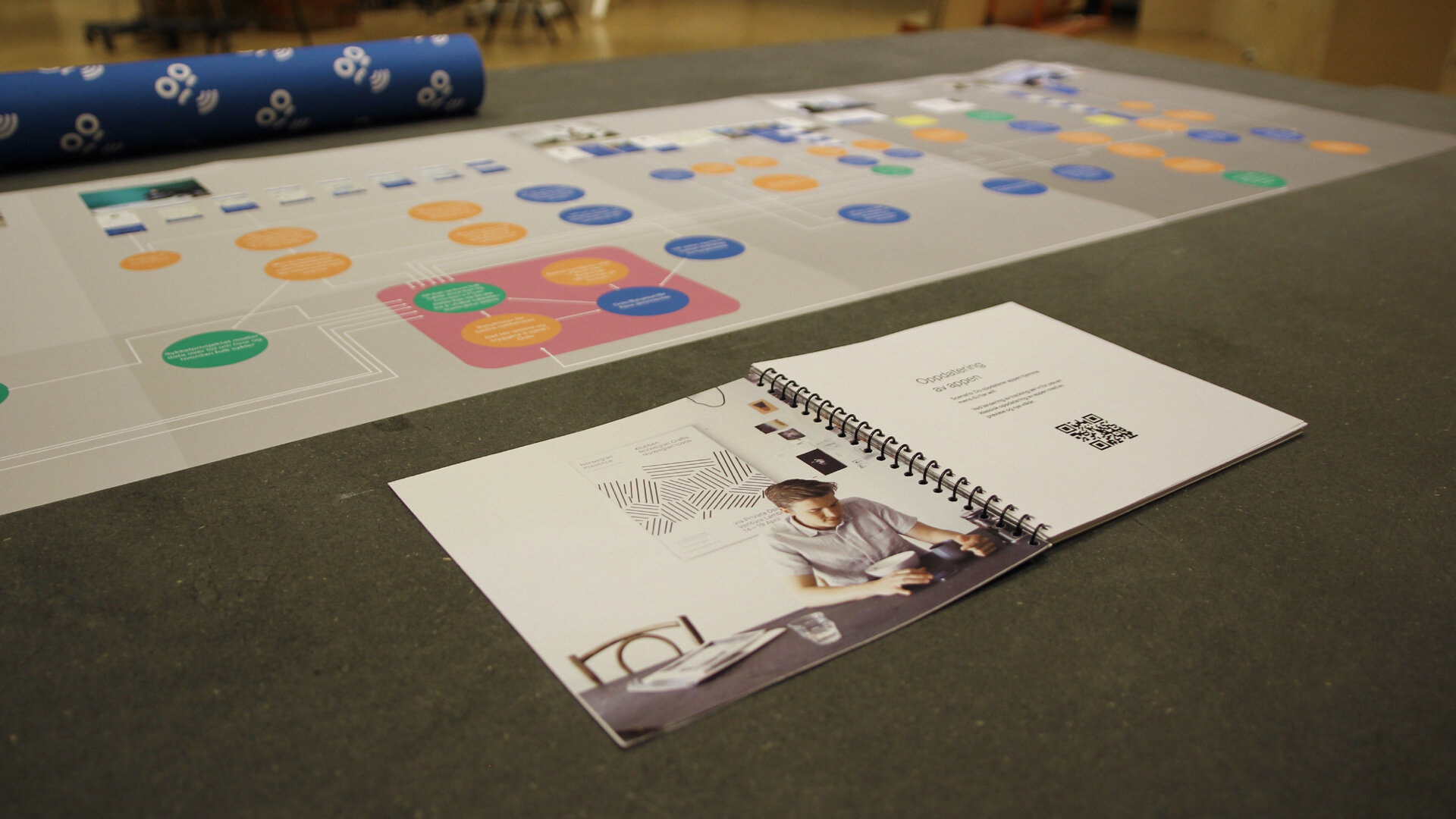
Systemic mapping
We tried to map what we thought the systematic effects would be if the different service concepts worked. With this map, we wanted to show that the concepts could generate more data for Sykkelprosjektet, and that they could use that data to make Oslo a better cycling city.
Presenting for actors
We brought the final map to Sykkelprsjektet. They were very engaged in our presentation, and wanted to continue working with us.

Final Deliveries
A concept we delivered to Sykkelprosjektet was a website sketch where Sykkelprosjektet could see all the different data brought in from the Oslo City Bike service and their other sources of data. With this tool, they can convince other actors why they should build city bike lanes in specific areas.
Our deliveries to our main client, Oslo City Bike, was the Systematic map, our report, and a booklet of the different app ideas with the comments we got from the people in the streets. We also included links to the clickable prototypes, so that they could test them themselves.