NTF - Norwegian Top Football - New Identity
In this project I was lead designer. The aim of the project was to design a new logo for the Norwegian Top Football association. That is the association that is made up of all the top football clubs in the two top leagues in Norway. (Eliteserien and Obosliagen) With a new logo we also saw the need to update colours and fonts. So the logo project developed to i sprint identity project.
My role was to plan the process, lead the meatings, make presentations for each meating and prensent our direction. Design different directions and the final graphic design and logo.
Project by: Andreas Kalleberg, Taral Jansen, Jacob Pettersen
Project length: 3 months
Where: Æra Strategic Innovation
When: 2022
The Process
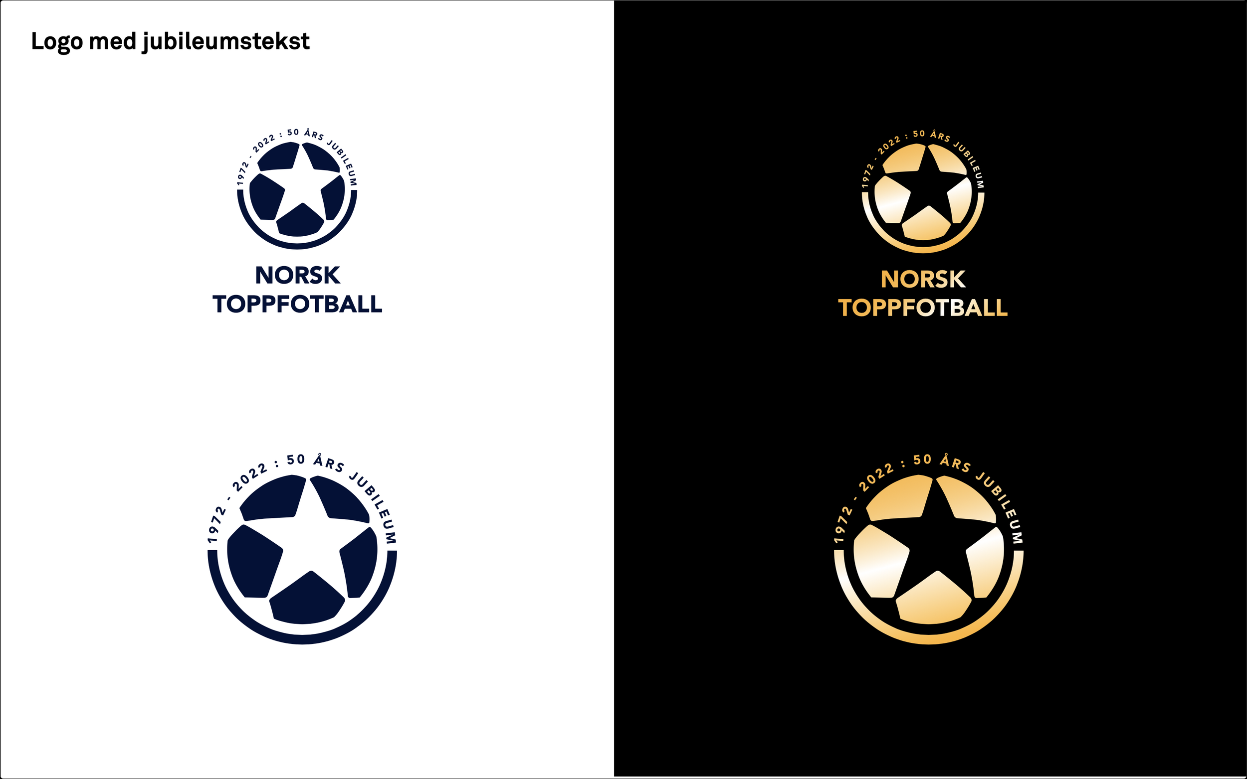
The design of the logo is based on a star and a football. The star because the association is working with the best footballers and clubs in Norway. The football because they work with football. It was also a thought behind the different components of the star which symbolise the different components of the association working together.
Underneath you can see one of the moodboards we used to develop the different directions for the logo The moodboard was based on the words football, entertainment and professional. We developed 5 different directions for a logo and presented it for the client. We decided together on logo C. in the middle. Because we liked the star and ball resemblance and clarity.


The delivery
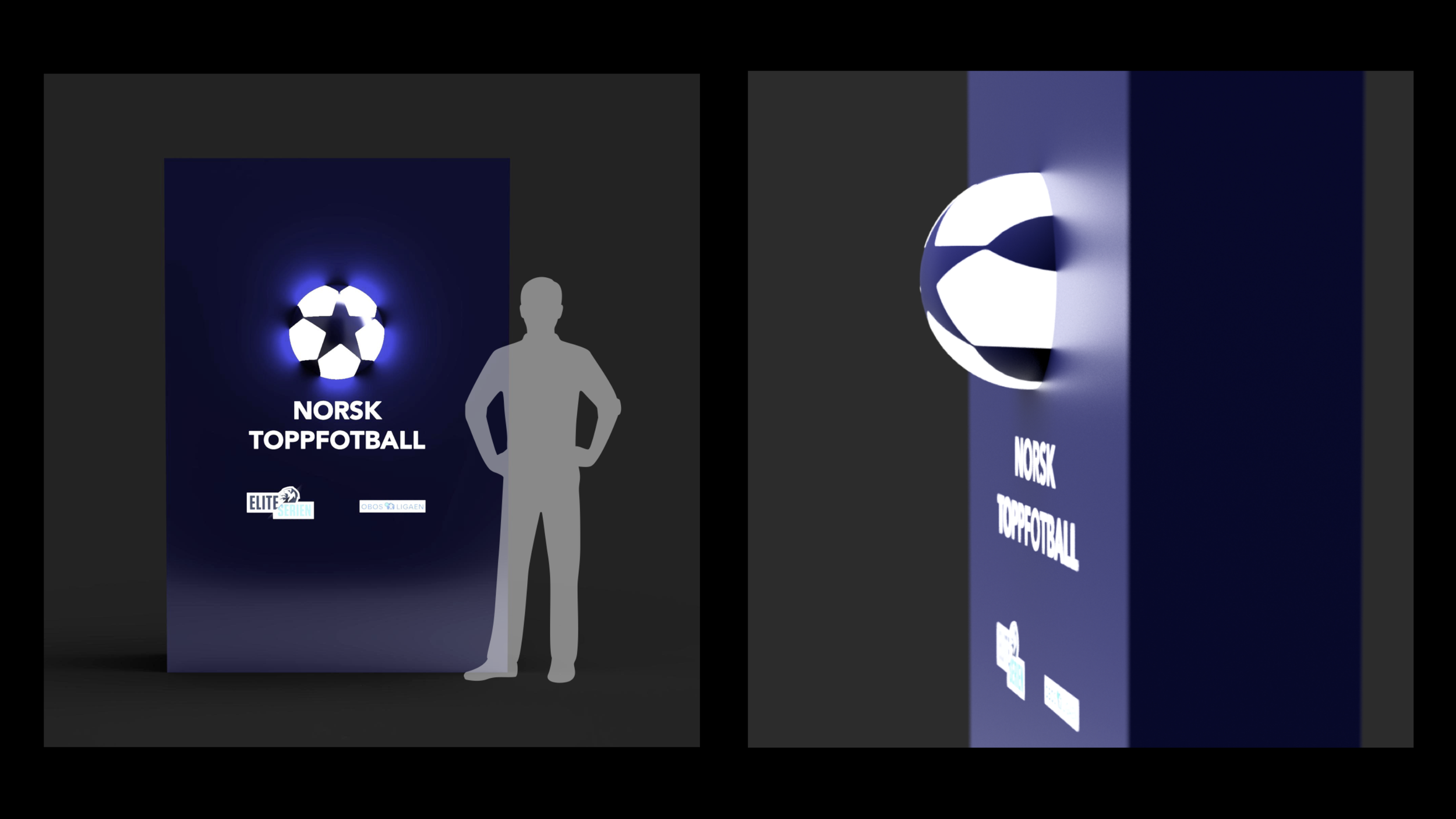
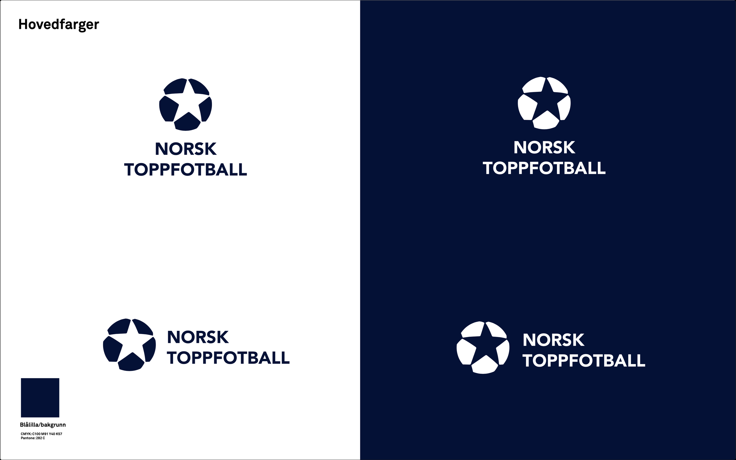
The photos under are examples taken from the design guide. We delivered sketches on how the logo could be used on a website, and app, how it could look in a football format. We delivered several anniversary versions of the logo. A logo wall, and what colours and fonts to use in different settings.


Text
Text