The Ski Association of Norway - New identity
The Norwegian Ski Federation (NSF) embarked on a transformative journey with ÆRA to redefine its brand in the modern era. Through comprehensive research and collaboration, ÆRA identified key challenges including fragmented branding and lack of shared goals. Together, they crafted a compelling brand story rooted in skiing's essence, focusing on inclusion, talent, community, and tradition.
A new brand architecture was developed to strengthen NSF's commercial and cultural aspects, leading to a refreshed visual identity by Heydays. By involving a broad task force from NSF throughout the process, co-creation and internal ownership were fostered. The result is a revitalized NSF, poised to shape its future with clarity and relevance. Launched in June 2023, the new brand serves as both a cultural and strategic tool, ensuring NSF's continued impact in civil society while resonating with 1.6 million Norwegian skiers.
My role was as a team member in the process of developing a new brand architecture and brand story. I also joined Haydays in the process of developing a new visual identity.
Project by: Andreas Kalleberg, Johanna Roppen, Eirik Langås, Jacob Pettersen + Haydays
Project length: 6 months
Where: Æra Strategic Innovation
When: 2022 - 2023
Brand Architecture
The story of the brand was that we need the top/elite people in the sports. but the elite is nothing without the base of the clubs and all the people helping from the ground up. Every sport has its own top. but is also connected with a ski lift as shown in the illustration, visualising that the sports still can and should collaborate where they can and want to.
More structure and rules
It was many supporting brands and logos under the ski association but that had developed without any rules or guiding. We had to create a grid of rules and guides for how the different brands under the NSF brand should look and appear.
Heydays
Heydays is a graphic design studio in Oslo, Norway that did the development of the graphic design and the website. The new website was a incredible improvement from the previous website.
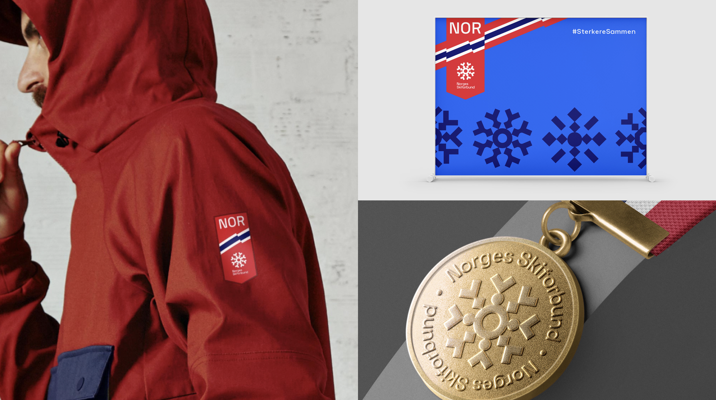
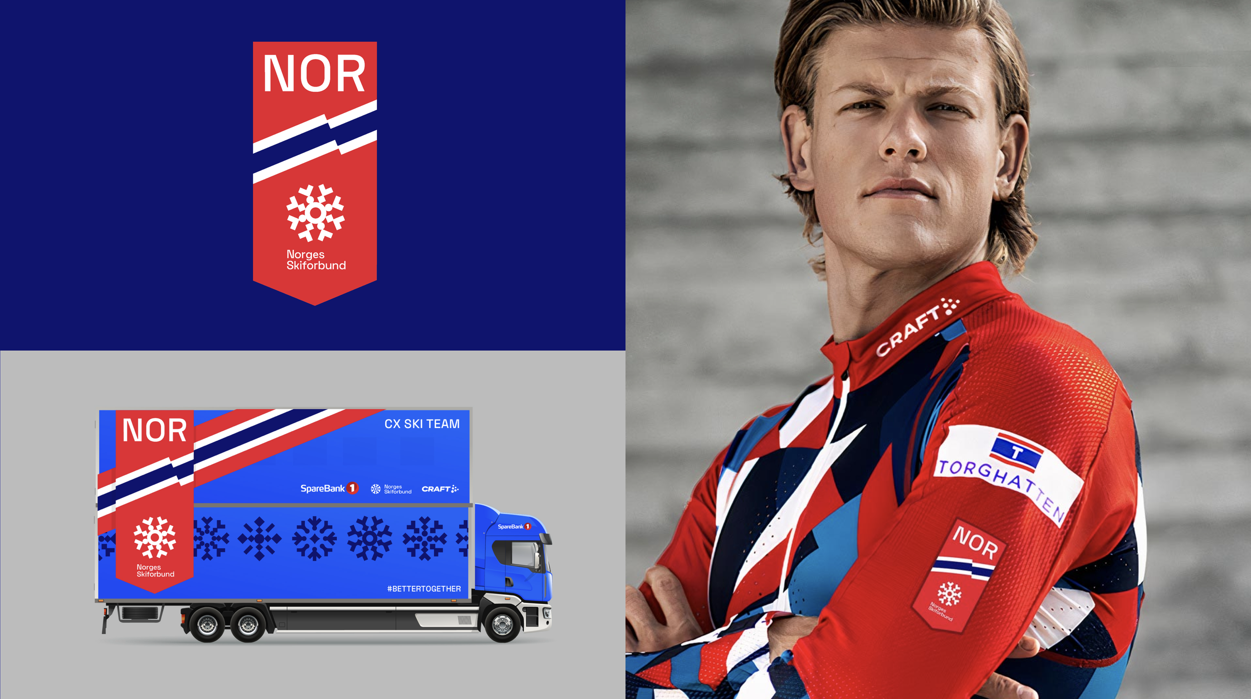
The identity
The new identity wants to show the spectre of all the different sports within the NSF association. The previous logo had cross country skiers in the logo which was miss leading because NSF is a association of many type of ski related sports, not only cross country related sports. The Snow crystal was also a symbol of snow of course, but also all the components that need to work together in a complex association to make sports good and developing. The colours are inspired by the Norwegian flag and by colour tones in snow.